
Website redesign
Website redesign
Website redesign
Web Design Illustration Content writing
Role
UX/UI Designer
Timeline
2022
TL;DR
Through designing a website, I gained valuable experience in capturing a brand's essence through visual elements, handling design feedback, writing purposeful website content, and designing with SEO structure.
Building a website from scratch
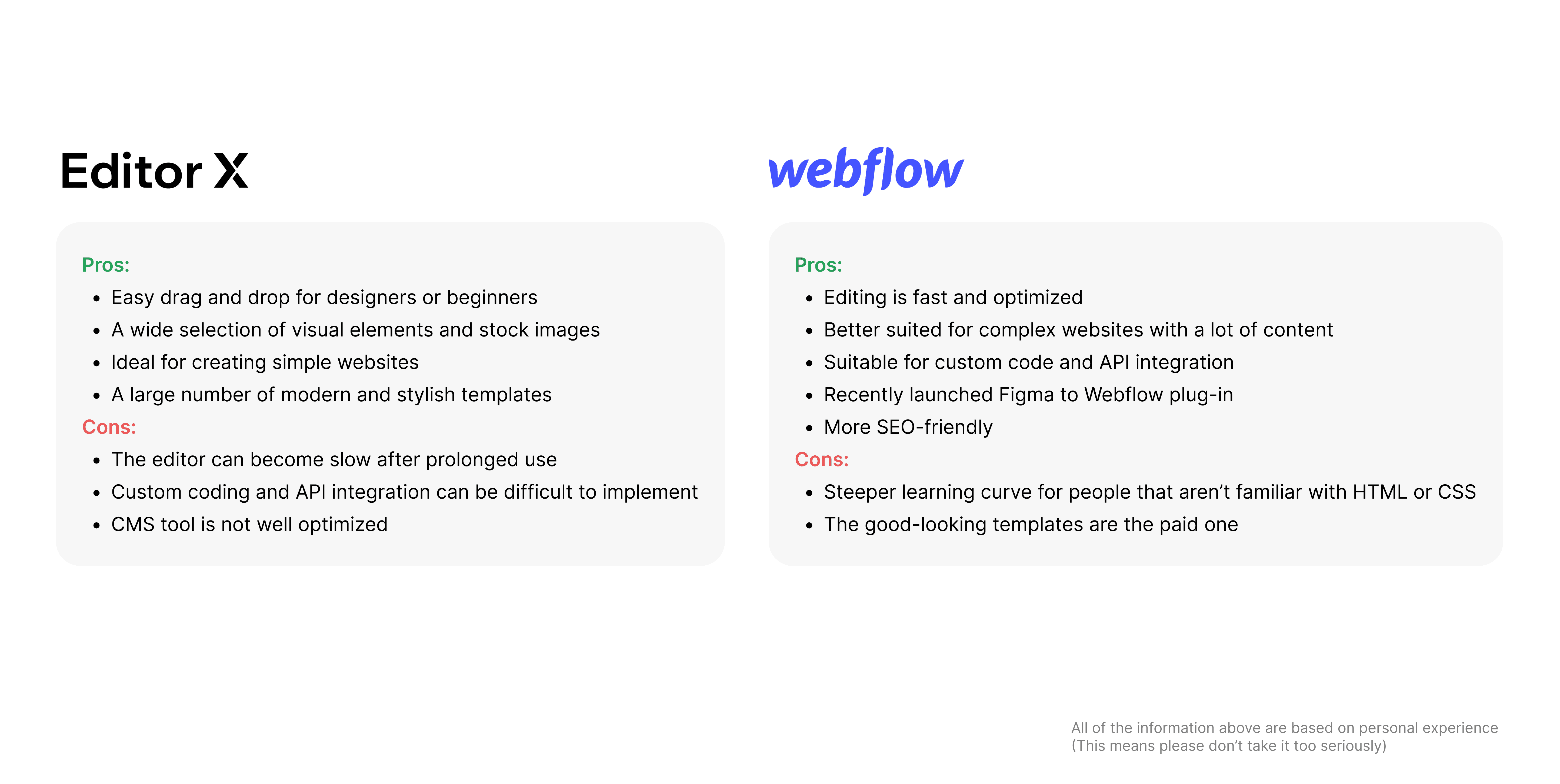
In the time that everyone can design a website, redesigning a company's website should be a piece of cake, right? Just use a website builder and that’s it.
However, since our website has specific requirements like multilingual support, SEO-friendliness (which I'll discuss later), API integrations, and Google Analytics installation, I narrowed down my options to two: EditorX by Wix and the well-known Webflow.
It's designing time
I decided to finalize the design in Figma before implementing it in Webflow. A few weeks after designing a website, I found myself struggling way more than I thought, even though I thought I did everything right step-by-step, from creating personas to laying out the sitemap and starting from the wireframe. However, the result is not quite right yet as the content, color, and layout don't fit together.
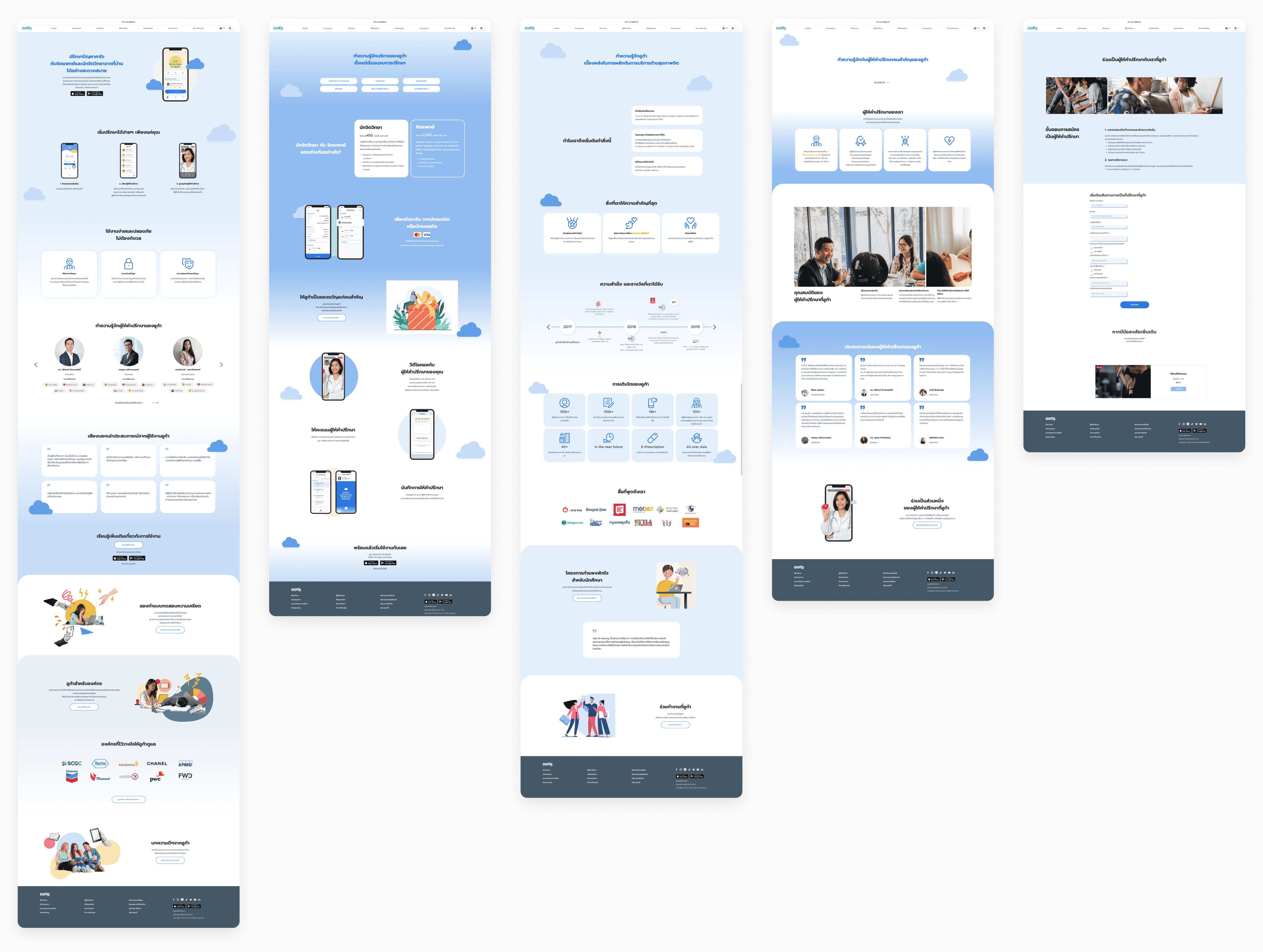
So, I had a chat with our stakeholders and team members to get some feedback on the design. And to be honest, I totally agree with their comments. They pointed out that the color was off, it didn't match our branding, and there was too much cloud elements.
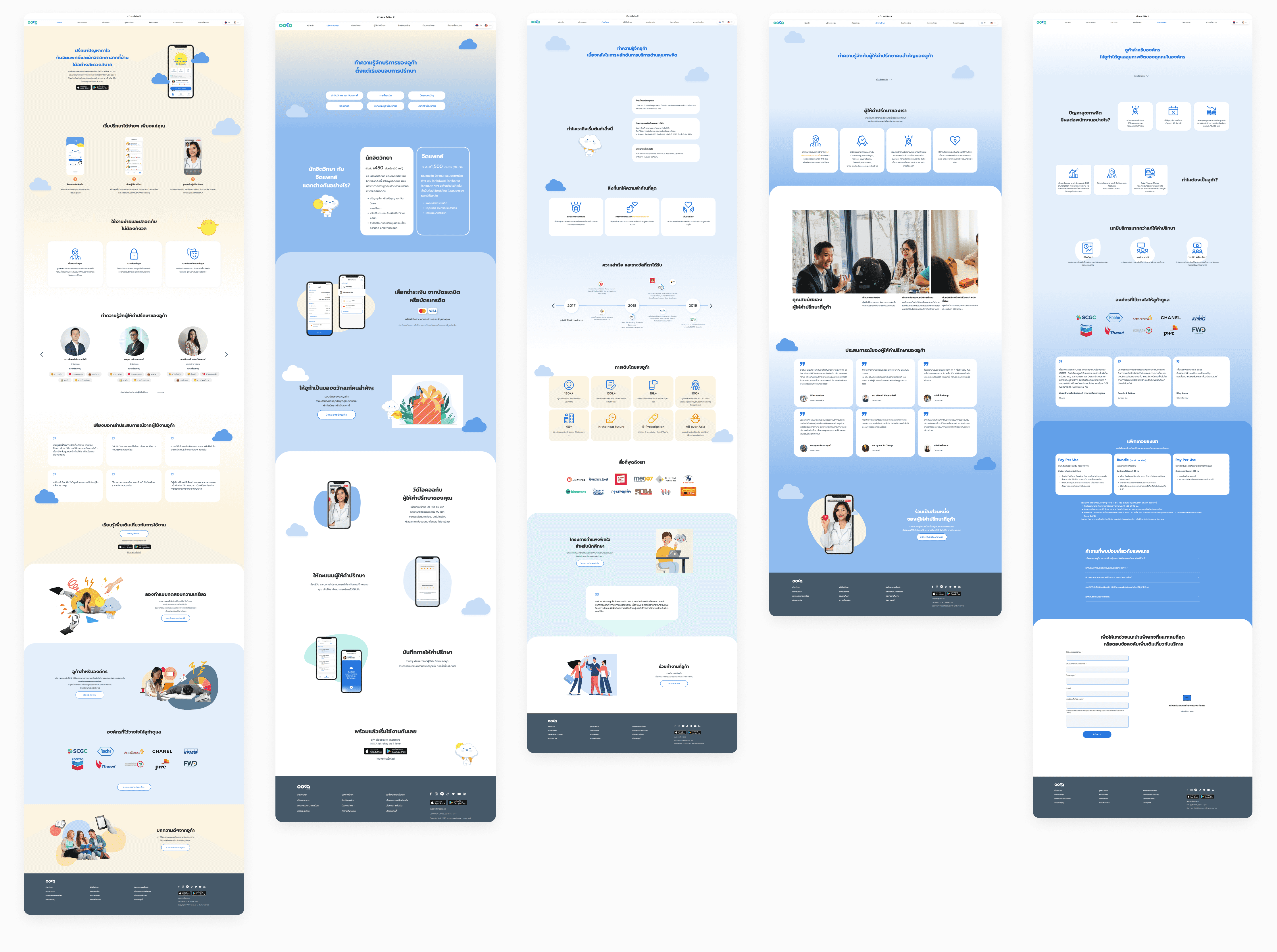
After attempting to adjust the design based on feedback, there are still some issues that need to be fixed. Although adding the bright color was a nice touch, the gradients appear odd, and the text size of the content is not emphasized enough.
"The stock photos feel fake", "The bold color is nice", "Are you sure this is the best layout?"
You see what’s going on here
After adjusting the design for many weeks, with more than 200 Figma comments and 5 usability tests hoping to be more user-friendly, I realized it was time for me to step back and take a look at the bigger picture to see where I was stuck. With the help of my Product Manager and fellow designer teammates, we decided to pause the visual design before it was too late.
The turning point
Fortunately, it wasn't too late to make changes. My biggest mistake was not designing the content in the right way. In my previous design, I assumed that I knew how the user would like it to be. However, the content came across as self-promoting and expected people to like us.
Thankfully, our product team had been conducting interviews with our app users and I had the opportunity to talk to them, empathize with them, and have a lovely conversation with our users.
So, I conducted a content audit, listed all the content on the page, and revised it to serve a better purpose. I tried to tell our company's story from the user's perspective by learning from the user interviews. What are their pain points, what do they want to know, who are we talking to, and what do we want them to do next?
What people are looking for on a mental health service website is not how easy it is to use the app or its cool features. They want to know how therapy can actually help them, if it's the right place for them, and how we can help improve their lives.
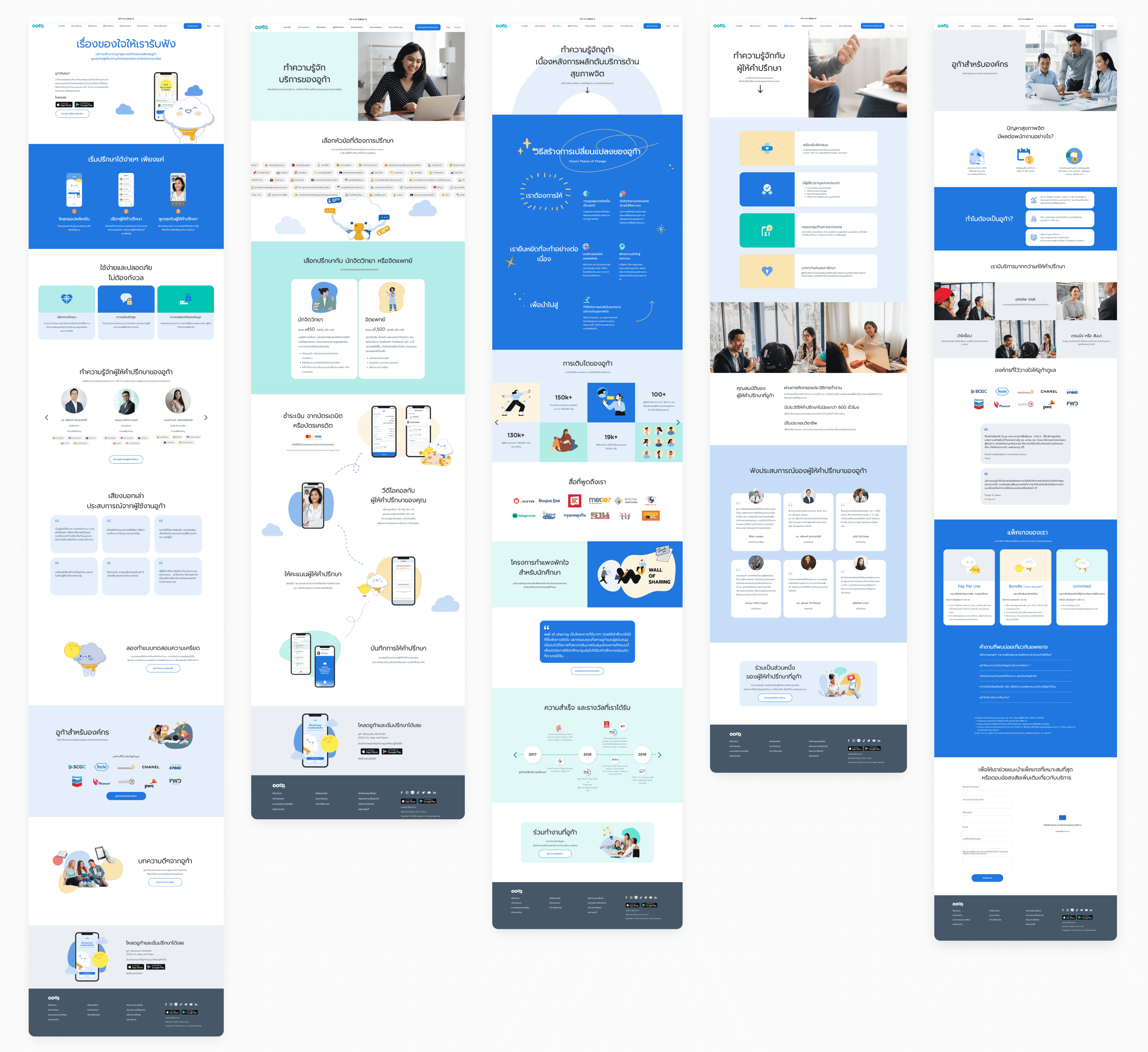
The Final Version
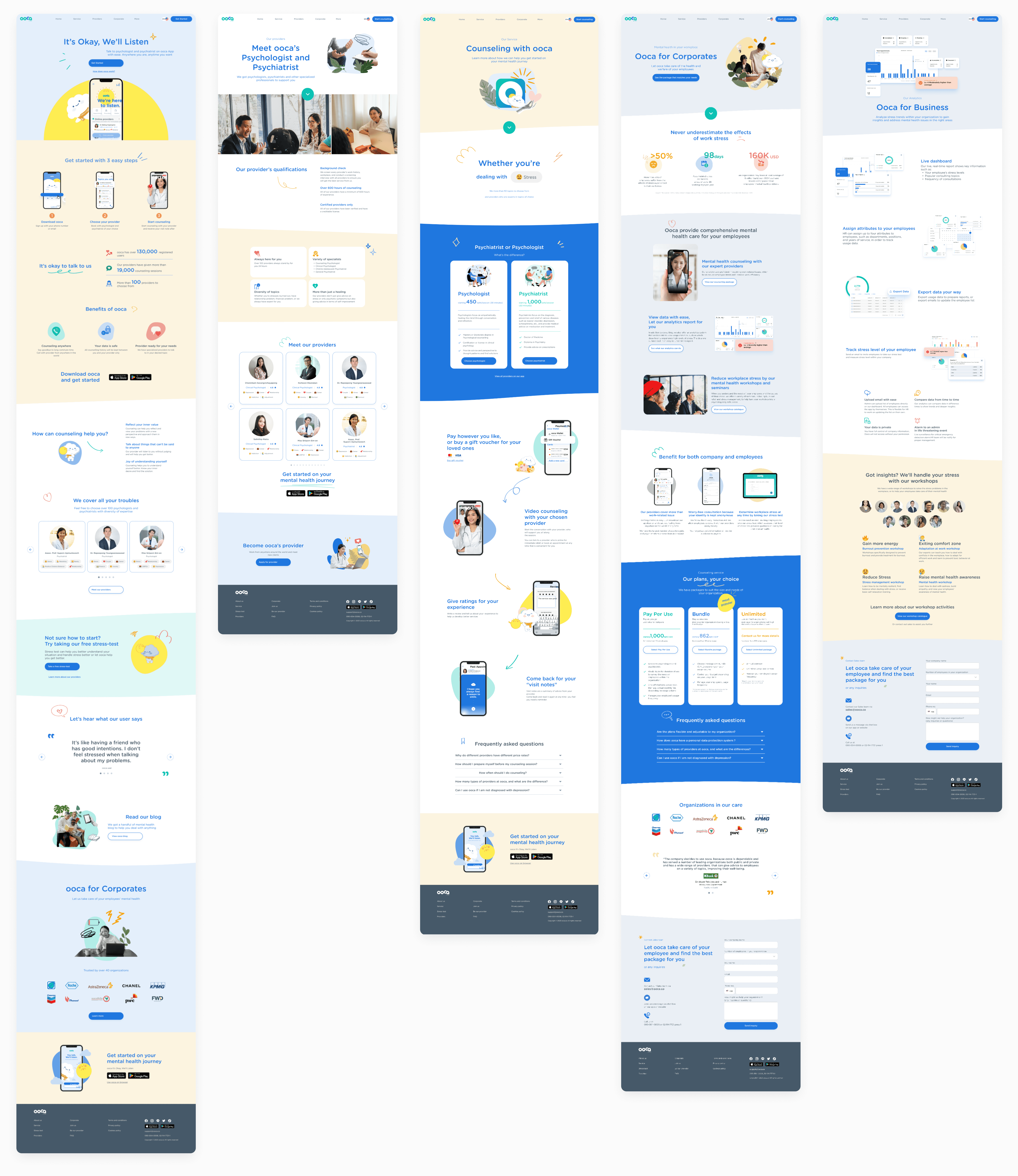
The new website feels alive, as if it is actually speaking to the audience. It welcomes them and displays the right information at the right time, with a sprinkling of playful visual elements and animations, in a more friendly way.
SEO this, SEO that
Why is everyone so obsessed with SEO? As a designer, it can feel like we're forced to follow a specific structure and provide image descriptions that don't make any sense. But what actually makes for good SEO? Search engines essentially mimic the actions of a real human user, so a high SEO score can be achieved by creating a website that is user-friendly and contains meaningful, useful content, rather than simply cramming in as many keywords as possible.
In fact, designing content with H1 and H2 tags and other things in mind makes sense not only for SEO, but also for improving the user experience. By structuring the content in a easy-to-follow manner, users can quickly find the information they need, and search engines can better understand the relevance of the content.
Designing a blog with A/B testing
After finishing the website design, I took on the task of designing a blog. Learning from my previous mistakes, I began with the content first.
Other than the requirements from the marketing team, there are many decisions to make when designing a blog, such as:
Which graphic style should I use?
Which Thai font suits the content better?
Should there be a summary section at the end of the blog post?
Should I display the blog author?
So I conducted a casual interactive A/B testing poll on my Instagram to let my friends share their thoughts.
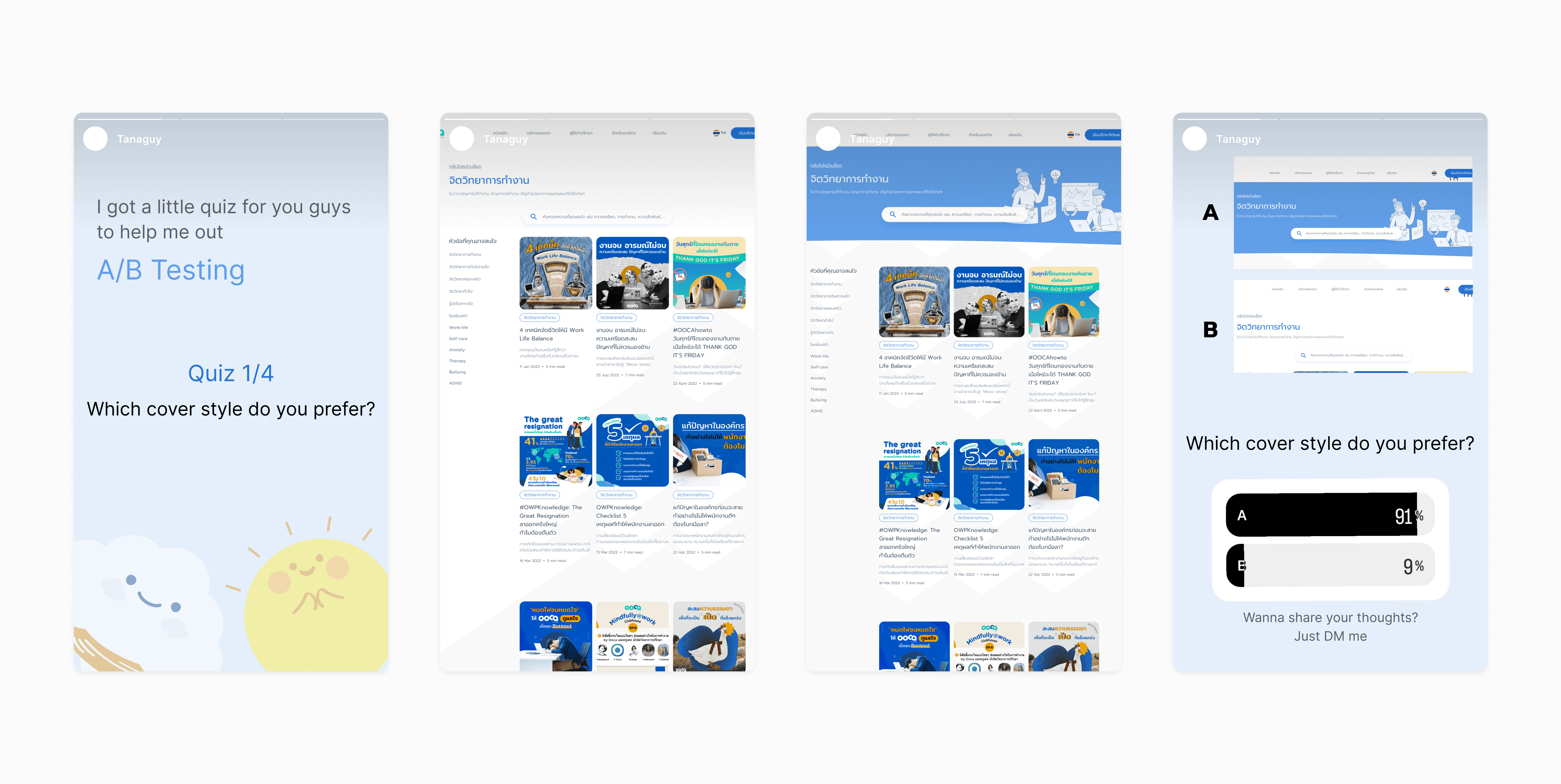
With over 200 viewers and more than 100 votes, I was able to solidify my ideas and choose the best approach to design a blog. Plus, there were many replies to the poll, and it was the perfect chance to understand other people's opinions more.
Building a website from scratch
In the time that everyone can design a website, redesigning a company's website should be a piece of cake, right? Just use a website builder and that’s it.
However, since our website has specific requirements like multilingual support, SEO-friendliness (which I'll discuss later), API integrations, and Google Analytics installation, I narrowed down my options to two: EditorX by Wix and the well-known Webflow.
It's designing time
I decided to finalize the design in Figma before implementing it in Webflow. A few weeks after designing a website, I found myself struggling way more than I thought, even though I thought I did everything right step-by-step, from creating personas to laying out the sitemap and starting from the wireframe. However, the result is not quite right yet as the content, color, and layout don't fit together.
So, I had a chat with our stakeholders and team members to get some feedback on the design. And to be honest, I totally agree with their comments. They pointed out that the color was off, it didn't match our branding, and there was too much cloud elements.
After attempting to adjust the design based on feedback, there are still some issues that need to be fixed. Although adding the bright color was a nice touch, the gradients appear odd, and the text size of the content is not emphasized enough.
"The stock photos feel fake", "The bold color is nice", "Are you sure this is the best layout?"
You see what’s going on here
After adjusting the design for many weeks, with more than 200 Figma comments and 5 usability tests hoping to be more user-friendly, I realized it was time for me to step back and take a look at the bigger picture to see where I was stuck. With the help of my Product Manager and fellow designer teammates, we decided to pause the visual design before it was too late.
The turning point
Fortunately, it wasn't too late to make changes. My biggest mistake was not designing the content in the right way. In my previous design, I assumed that I knew how the user would like it to be. However, the content came across as self-promoting and expected people to like us.
Thankfully, our product team had been conducting interviews with our app users and I had the opportunity to talk to them, empathize with them, and have a lovely conversation with our users.
So, I conducted a content audit, listed all the content on the page, and revised it to serve a better purpose. I tried to tell our company's story from the user's perspective by learning from the user interviews. What are their pain points, what do they want to know, who are we talking to, and what do we want them to do next?
What people are looking for on a mental health service website is not how easy it is to use the app or its cool features. They want to know how therapy can actually help them, if it's the right place for them, and how we can help improve their lives.
The Final Version
The new website feels alive, as if it is actually speaking to the audience. It welcomes them and displays the right information at the right time, with a sprinkling of playful visual elements and animations, in a more friendly way.
SEO this, SEO that
Why is everyone so obsessed with SEO? As a designer, it can feel like we're forced to follow a specific structure and provide image descriptions that don't make any sense. But what actually makes for good SEO? Search engines essentially mimic the actions of a real human user, so a high SEO score can be achieved by creating a website that is user-friendly and contains meaningful, useful content, rather than simply cramming in as many keywords as possible.
In fact, designing content with H1 and H2 tags and other things in mind makes sense not only for SEO, but also for improving the user experience. By structuring the content in a easy-to-follow manner, users can quickly find the information they need, and search engines can better understand the relevance of the content.
Designing a blog with A/B testing
After finishing the website design, I took on the task of designing a blog. Learning from my previous mistakes, I began with the content first.
Other than the requirements from the marketing team, there are many decisions to make when designing a blog, such as:
Which graphic style should I use?
Which Thai font suits the content better?
Should there be a summary section at the end of the blog post?
Should I display the blog author?
So I conducted a casual interactive A/B testing poll on my Instagram to let my friends share their thoughts.
With over 200 viewers and more than 100 votes, I was able to solidify my ideas and choose the best approach to design a blog. Plus, there were many replies to the poll, and it was the perfect chance to understand other people's opinions more.
© Tanakarn C. 2026
guytanakarn@gmail.com
© Tanakarn C. 2026
guytanakarn@gmail.com