Payment flow optimization
Payment flow optimization
Payment flow optimization
User flow UX writing
Role
UX/UI designer
Timeline
September - November 2022
TL;DR
I redesigned a payment flow to handle all error cases by guiding the user to take action to solve the problem by themselves and giving the user the power to cancel their payment to avoid dark patterns.
The Problem
Surprisingly, many of our app users encountered errors with payments. They had no idea what was causing the errors, and couldn't troubleshoot on their own.
The challenge
To provide more context, the app is a telemedicine app, and the key challenge in optimizing payment is that the payment is time-sensitive. In order to book a counseling session with a psychologist, each user is given a specific time slot to make a payment in order to prevent overlapping bookings with other users.
How to design a payment flow with many scenarios?
What if they quit the app during booking or payment? What if they don't want to make a payment anymore? If a user leaves the app because of frustration they cannot resume the payment then other users won't able to make an appointment. By outlining the scenarios of what could go wrong during payment, I drafted a flow that allows users to cancel or continue from where they left off effortlessly, no matter what they are doing.
The most important aspect when designing a payment flow is to ensure that users can troubleshoot errors by themselves or at least understand the error. After diving deep to consider all the possibilities that could happen, I felt like Doctor Strange rewriting possible timelines and discovering outcomes, much like in Infinity War. After working closely with our tech lead and product manager, I finally completed the newly arranged payment flow, and it looks something like this.

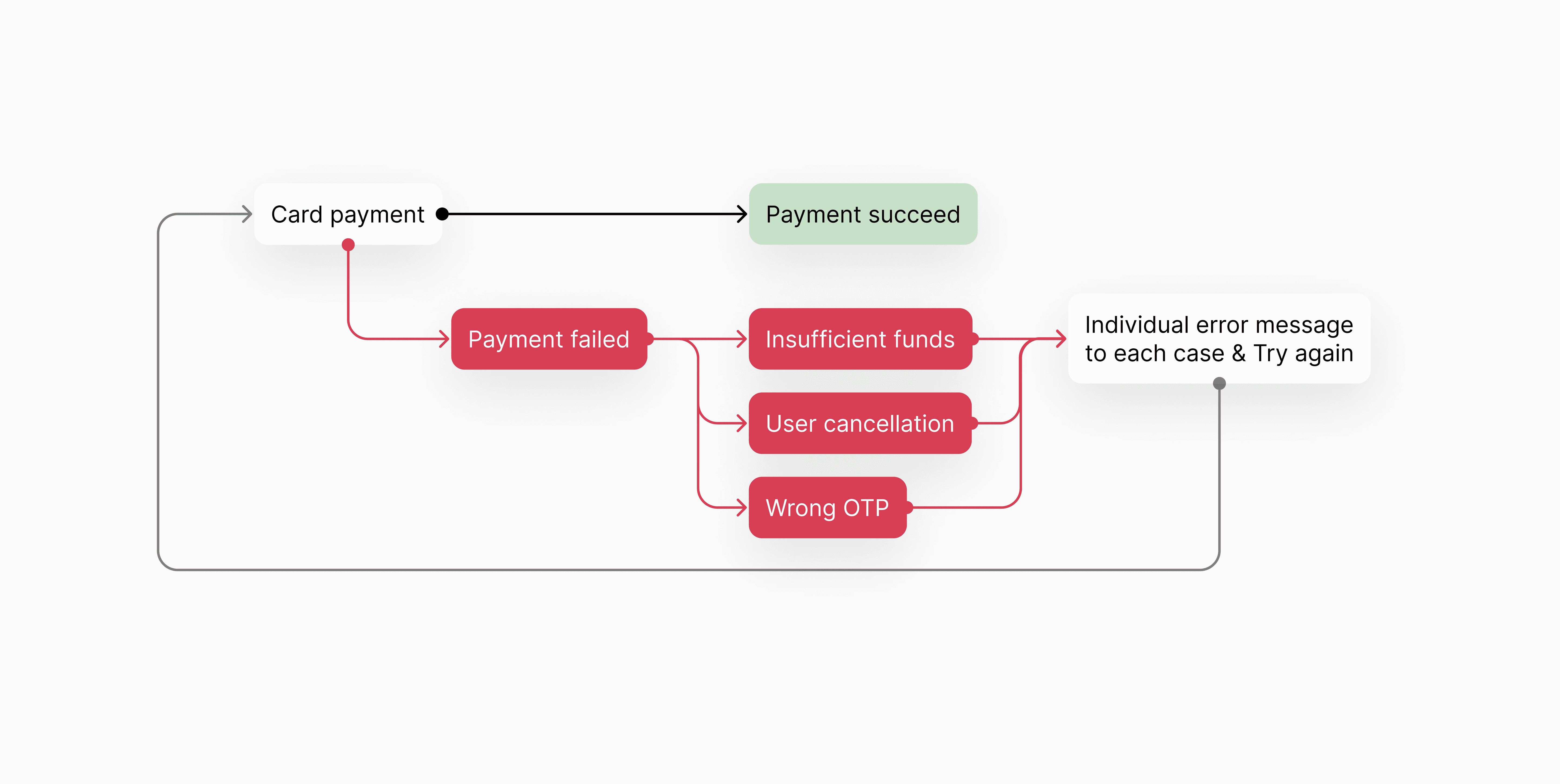
Yes, I know that's a lot to make sense out of. So, let me zoom in and show you real quick.
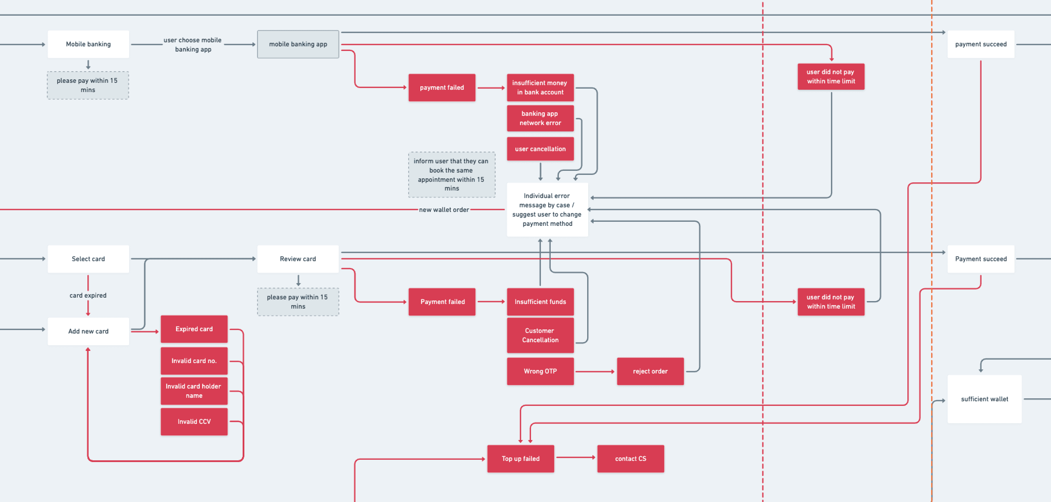
If you look closer, I've implemented a loop that allows the user to retry or change payment method in three main scenarios:
Adding a credit card or gift voucher code (to prevent expired cards or invalid codes)
Payment errors (such as network errors, insufficient funds, or wrong OTP)
The user cancel the payment or did not pay in time.
Now the 2nd part: letting users know what kind of error they're dealing with

The error screens were tailor-made for each error, and the app suggests what the user should or could do. If the user changes their mind, they shouldn't worry about finding a way to cancel their payment. Even if they accidentally close the app, they can continue through the same flow.
What I learned and wish I could have done better:
I was surprised at how much I enjoyed working on challenging tasks. Optimizing the payment flow within many technical constraints feels like working on a puzzle for me, and it is very rewarding in the end.
All the stories I've told you sound good. However, there's something I wish I could have done better. There's no solid evidence or concept testing to show that displaying error cases will actually reduce errors in payment. Additionally, due to the overwhelming nature of the project, we went straight from design to production without any peer reviews (which isn't the most ideal thing to do).
The Problem
Surprisingly, many of our app users encountered errors with payments. They had no idea what was causing the errors, and couldn't troubleshoot on their own.
The challenge
To provide more context, the app is a telemedicine app, and the key challenge in optimizing payment is that the payment is time-sensitive. In order to book a counseling session with a psychologist, each user is given a specific time slot to make a payment in order to prevent overlapping bookings with other users.
How to design a payment flow with many scenarios?
What if they quit the app during booking or payment? What if they don't want to make a payment anymore? If a user leaves the app because of frustration they cannot resume the payment then other users won't able to make an appointment. By outlining the scenarios of what could go wrong during payment, I drafted a flow that allows users to cancel or continue from where they left off effortlessly, no matter what they are doing.
The most important aspect when designing a payment flow is to ensure that users can troubleshoot errors by themselves or at least understand the error. After diving deep to consider all the possibilities that could happen, I felt like Doctor Strange rewriting possible timelines and discovering outcomes, much like in Infinity War. After working closely with our tech lead and product manager, I finally completed the newly arranged payment flow, and it looks something like this.
Yes, I know that's a lot to make sense out of. So, let me zoom in and show you real quick.
If you look closer, I've implemented a loop that allows the user to retry or change payment method in three main scenarios:
Adding a credit card or gift voucher code (to prevent expired cards or invalid codes)
Payment errors (such as network errors, insufficient funds, or wrong OTP)
The user cancel the payment or did not pay in time.
Now the 2nd part: letting users know what kind of error they're dealing with
The error screens were tailor-made for each error, and the app suggests what the user should or could do. If the user changes their mind, they shouldn't worry about finding a way to cancel their payment. Even if they accidentally close the app, they can continue through the same flow.
What I learned and wish I could have done better:
I was surprised at how much I enjoyed working on challenging tasks. Optimizing the payment flow within many technical constraints feels like working on a puzzle for me, and it is very rewarding in the end.
All the stories I've told you sound good. However, there's something I wish I could have done better. There's no solid evidence or concept testing to show that displaying error cases will actually reduce errors in payment. Additionally, due to the overwhelming nature of the project, we went straight from design to production without any peer reviews (which isn't the most ideal thing to do).
© Tanakarn C. 2026
guytanakarn@gmail.com
© Tanakarn C. 2026
guytanakarn@gmail.com