

App icon redesign
App icon redesign
App icon redesign
A/B Testing Visual design
A/B Testing Visual design
A/B Testing Visual design
Role
Role
Role
UX/UI designer
UX/UI designer
UX/UI designer
Timeline
Timeline
Timeline
January 2021
January 2021
January 2021
TL;DR
TL;DR
TL;DR
To improve the app icon's design, I decided to incorporate mascots, as they create a better first impression and smoother user experience. Additionally, I used A/B testing to make more informed design decisions, which resulted in over three times more conversions for the new icon compared to the previous one.
How can the app icon be properly redesigned?
An app icon is like the first impression of an app. It tells users what the app is all about and catches their attention in the app store, intriguing them to download it. It needs to look good, whether it's on the home screen or tucked away in a folder.
My approach using a mascot
I decided to incorporate our mascot, which was already featured on various screens of the app, confirmation messages, and the company's deck. Adding a little face to the app can make it feel more approachable and supportive, as a mental health app should be.
One of the reasons I decided to use the mascot is because I did some digging around and got inspired by an app that relies on many user interactions such as mobile games, headspace, or language learning like Duolingo. I figured that adding a little mascot could make the app more relatable to users in very personal ways.
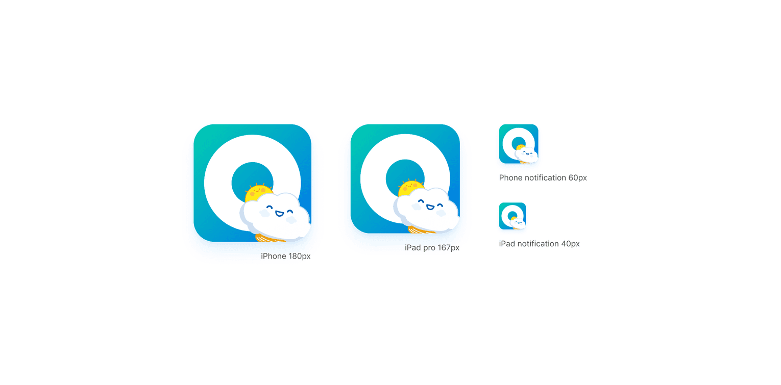
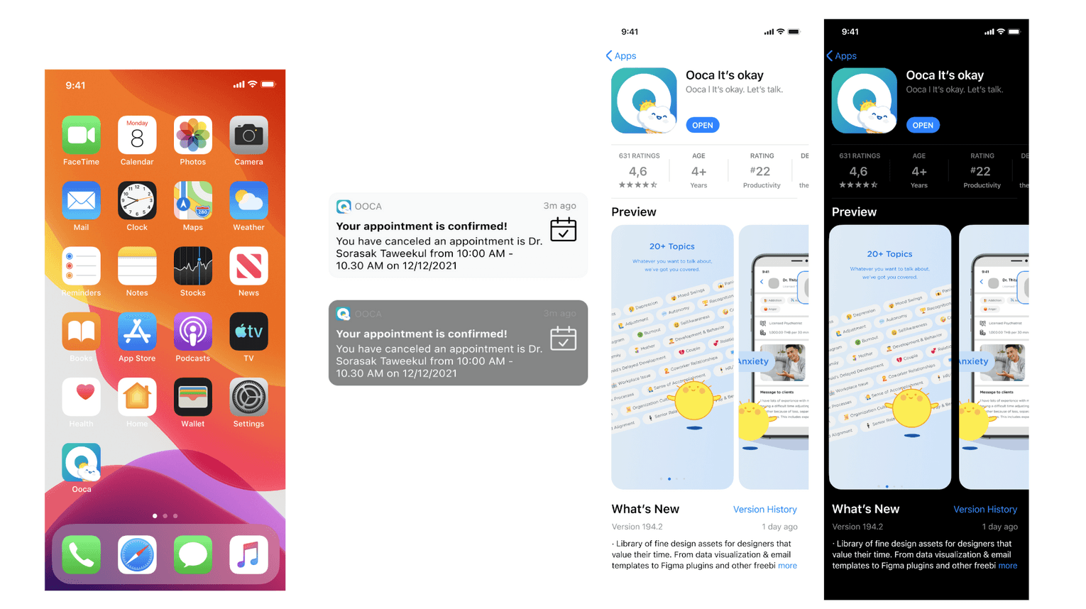
I also considered the contexts where the app icon will be displayed, whether it be in full size on the app store or in the smallest glimpse on the notification badge. I also made sure that the icon is easy to glance at in both light and dark themes.
Introduction to A/B testing
I used to work as an interior designer, and I never heard of A/B testing back then. Instead, I would show clients a few design options and let them decide. However, thanks to my product manager's guidance, I was able to explore the Google Play A/B testing console to compare various design options, and it was a game-changer! This experience allowed me, for the very first time, to test design options with hundreds, or even thousands of people. It was a life-changing moment in my career as a designer, and I soon found myself incorporating A/B testing into future projects.
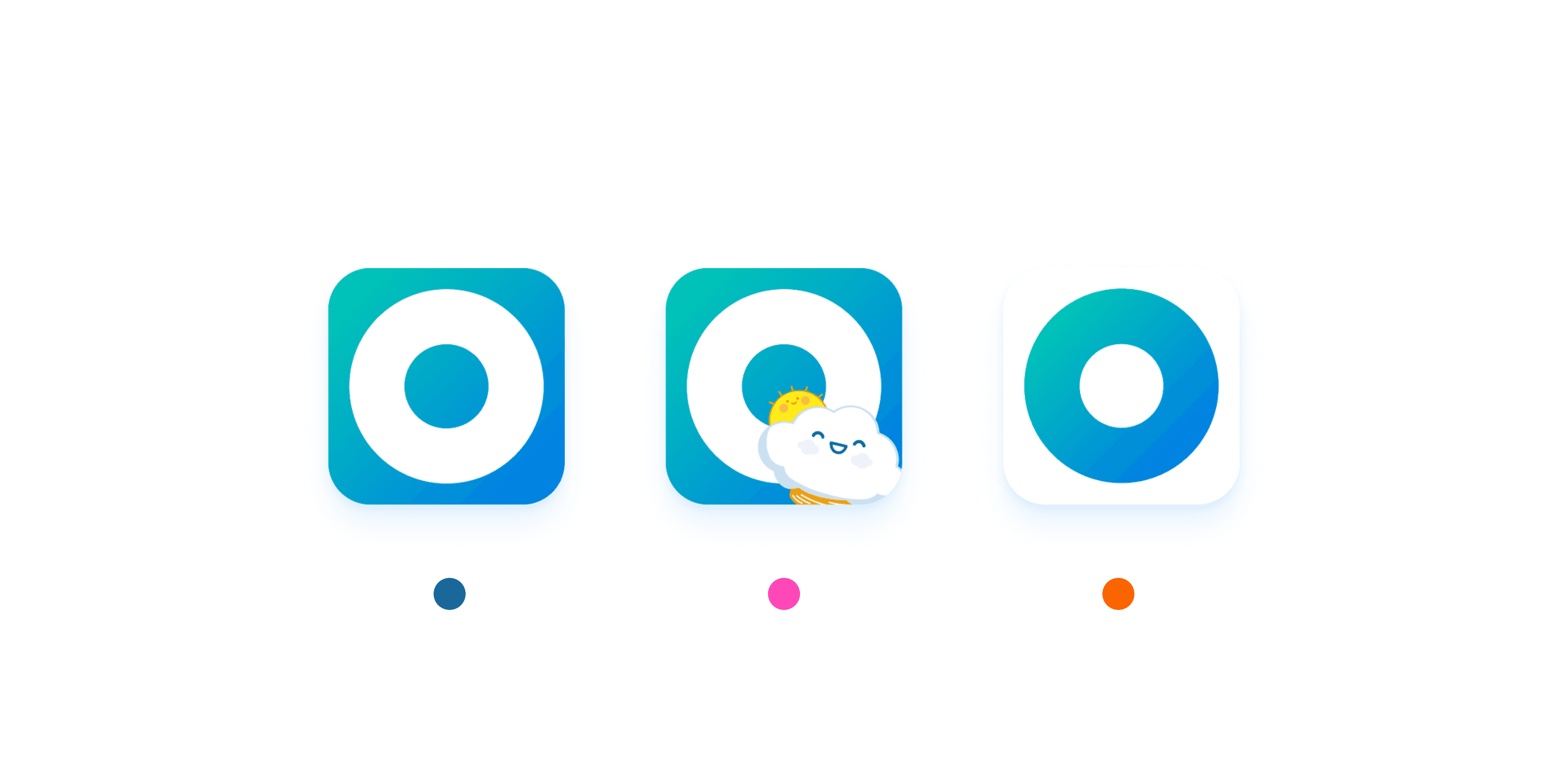
These are the 3 options for the new app icon; the refresh(same icon with updated color), the mascot, and the inverted icon
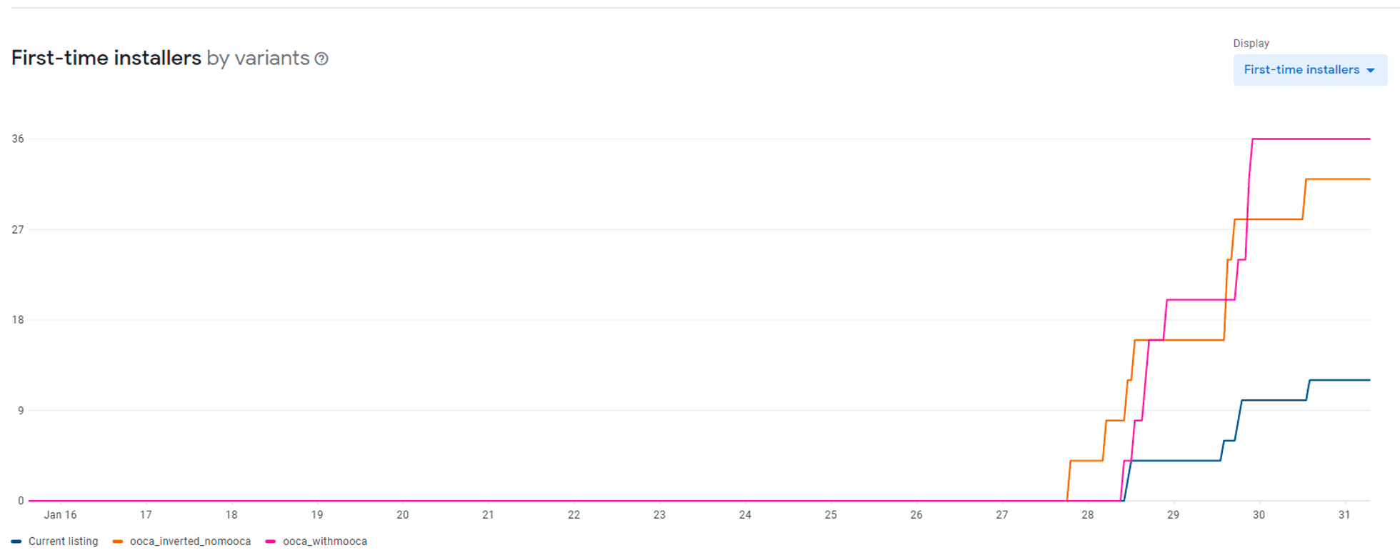
The test result aligns with my hypothesis; mascots came out on top with an increase in installations over the other option.
The hands-off
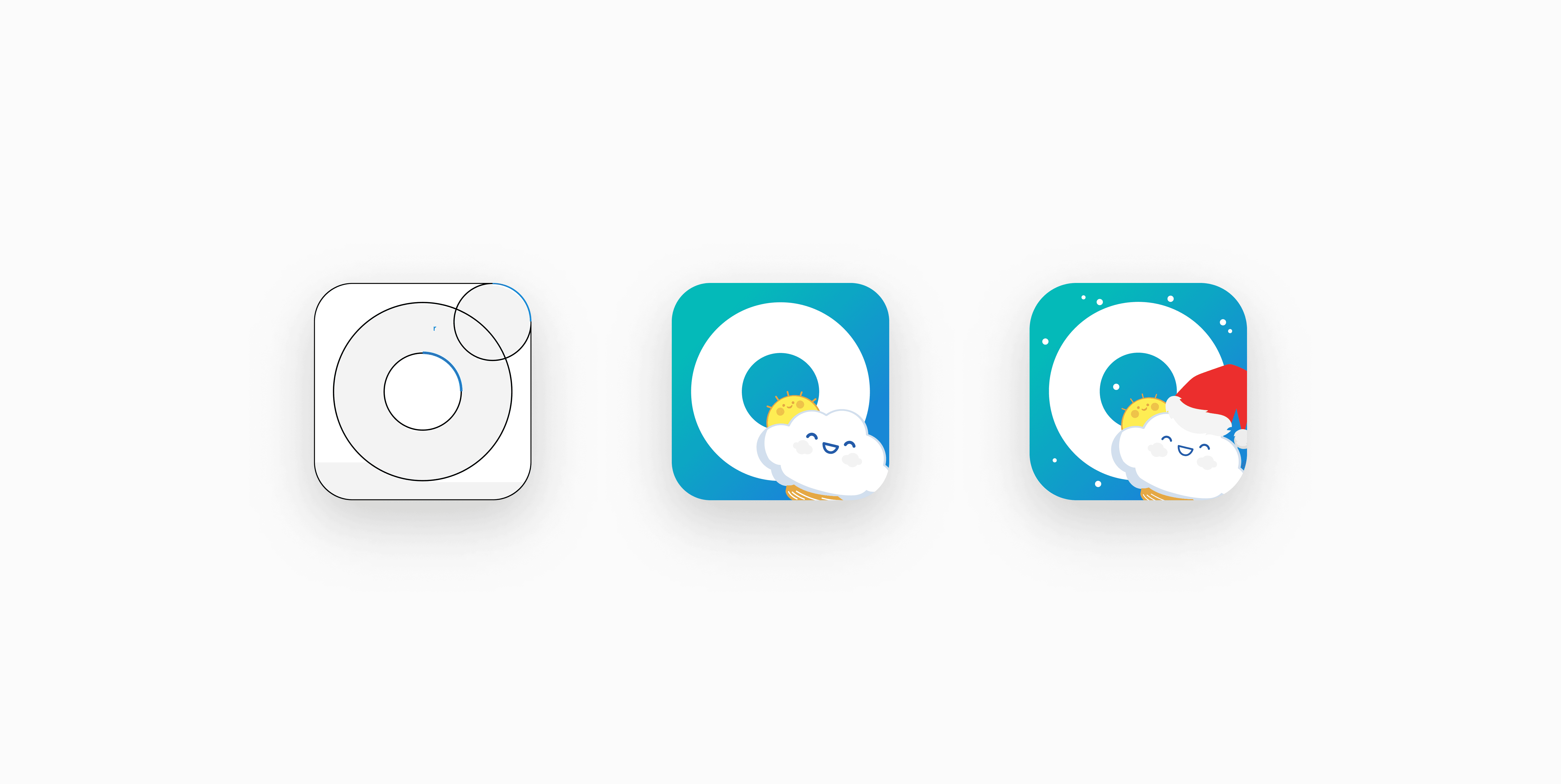
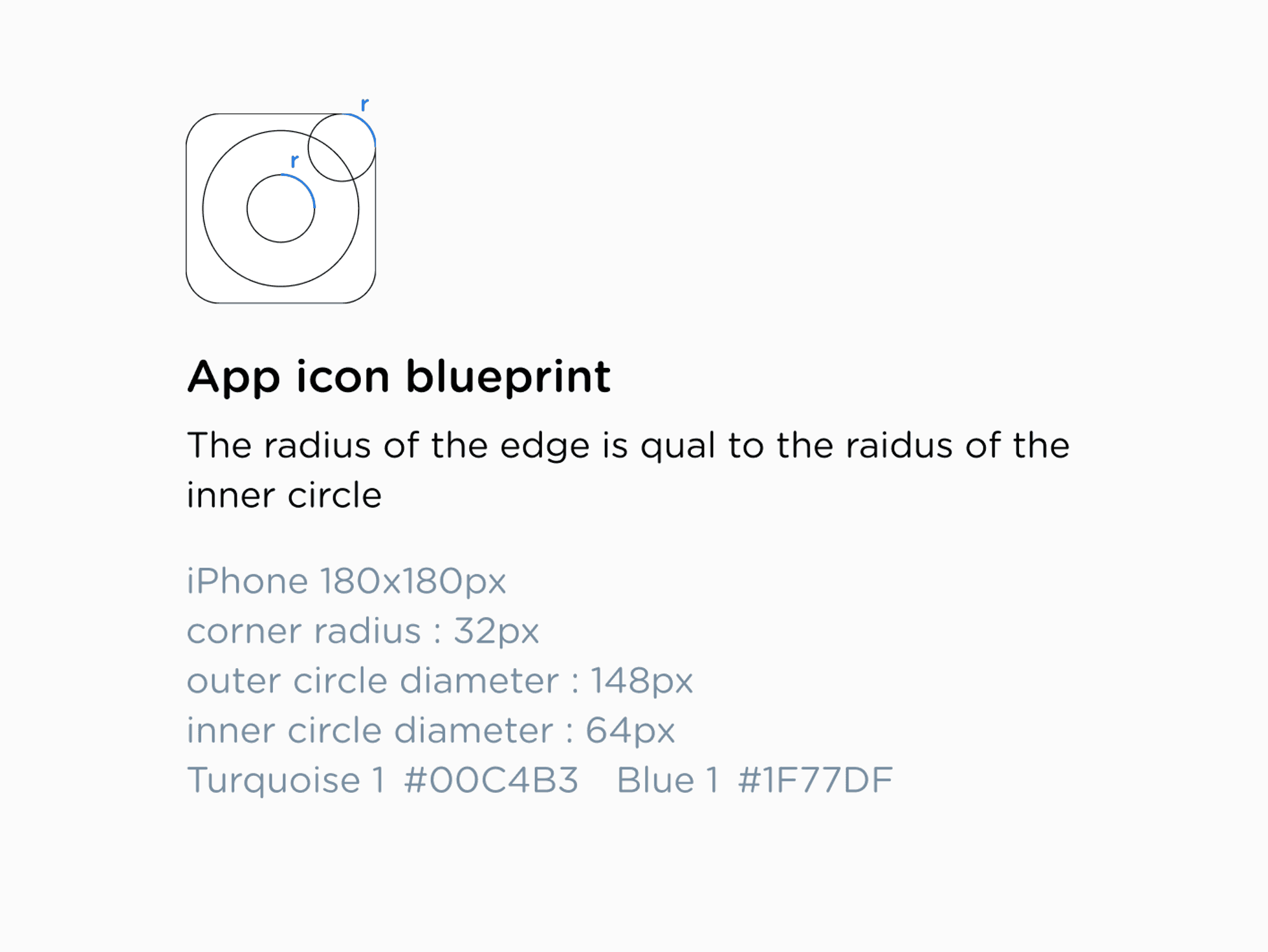
Although the icon is just a vector file that is easy to share, I went the extra mile by documenting how to recreate it in case the original file is lost
Last but not least
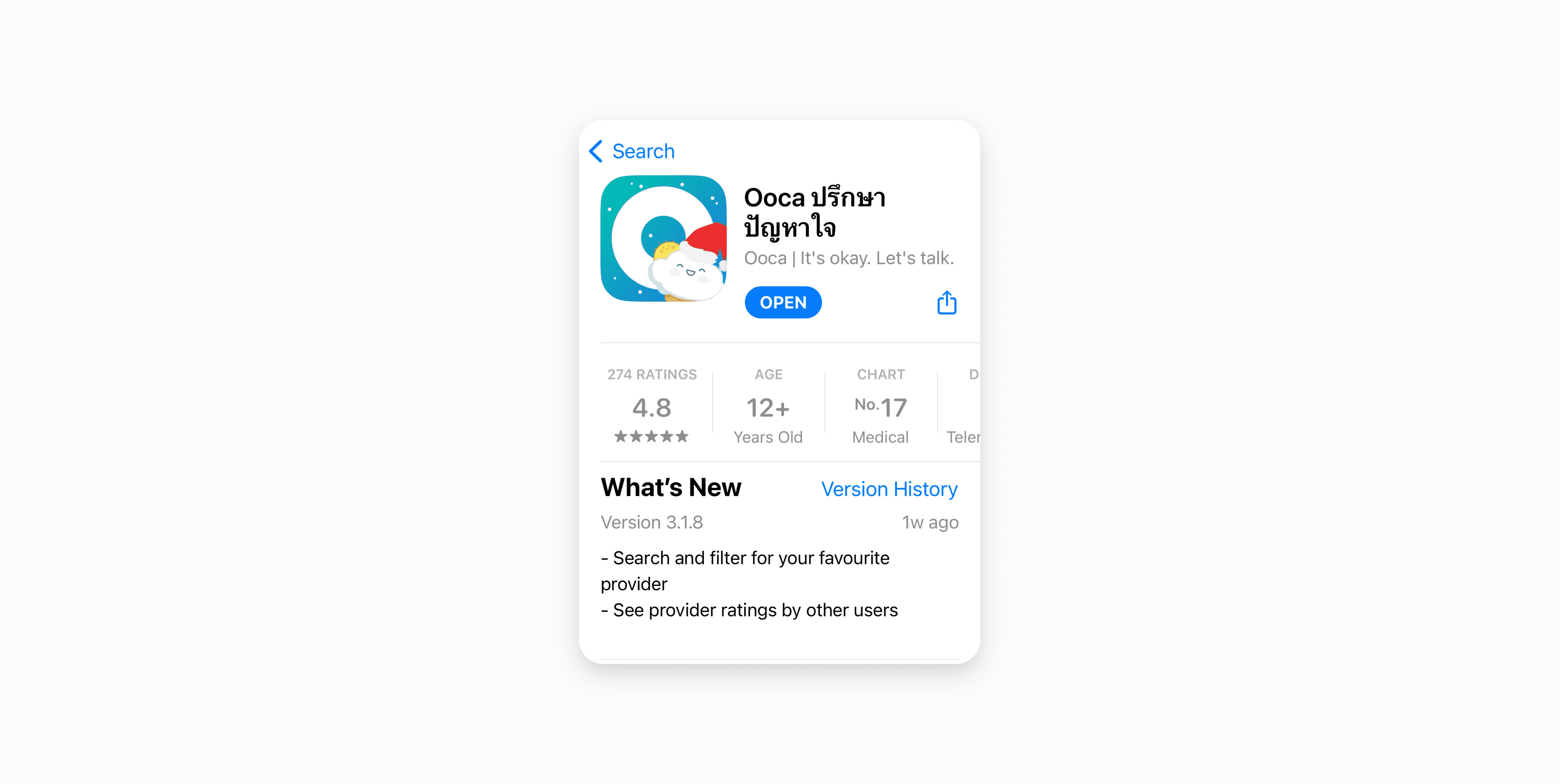
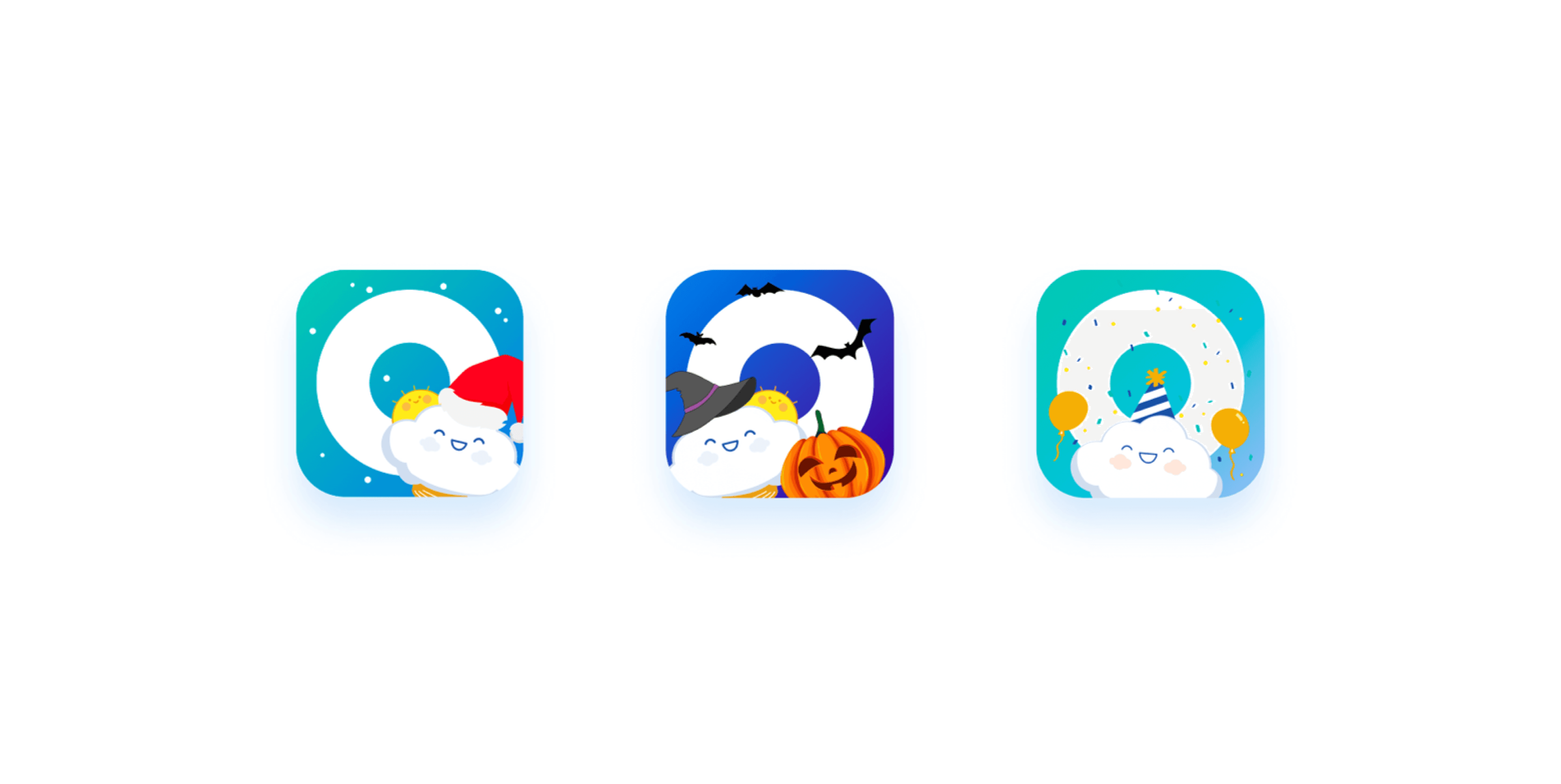
Finally, it's December, and it's time for that one special trick I have up my sleeve. The festive version of the icon I planned and designed ahead of time is finally being released along with the new app minor update. I hope the little Santa hat I added to our mascot keeps it warm during the cold winter season. And another perk of using a mascot is that it can add a character to your app during seasons or festivals.
What I wish I have done differently
Even though the overall redesign process went smoothly, I didn't explore the other variant, the inverted color one, which ranked 2nd. Looking back at the A/B testing results, the long-term data showed that the option I decided to launch didn't significantly outperform the other option. I wish I could investigate the second icon design more, so I'm keeping this as a lesson learned not to overlook small details in the future.
How can the app icon be properly redesigned?
An app icon is like the first impression of an app. It tells users what the app is all about and catches their attention in the app store, intriguing them to download it. It needs to look good, whether it's on the home screen or tucked away in a folder.
My approach using a mascot
I decided to incorporate our mascot, which was already featured on various screens of the app, confirmation messages, and the company's deck. Adding a little face to the app can make it feel more approachable and supportive, as a mental health app should be.
One of the reasons I decided to use the mascot is because I did some digging around and got inspired by an app that relies on many user interactions such as mobile games, headspace, or language learning like Duolingo. I figured that adding a little mascot could make the app more relatable to users in very personal ways.

I also considered the contexts where the app icon will be displayed, whether it be in full size on the app store or in the smallest glimpse on the notification badge. I also made sure that the icon is easy to glance at in both light and dark themes.

Introduction to A/B testing
I used to work as an interior designer, and I never heard of A/B testing back then. Instead, I would show clients a few design options and let them decide. However, thanks to my product manager's guidance, I was able to explore the Google Play A/B testing console to compare various design options, and it was a game-changer! This experience allowed me, for the very first time, to test design options with hundreds, or even thousands of people. It was a life-changing moment in my career as a designer, and I soon found myself incorporating A/B testing into future projects.

These are the 3 options for the new app icon; the refresh(same icon with updated color), the mascot, and the inverted icon

The test result aligns with my hypothesis; mascots came out on top with an increase in installations over the other option.
The hands-off
Although the icon is just a vector file that is easy to share, I went the extra mile by documenting how to recreate it in case the original file is lost

Last but not least
Finally, it's December, and it's time for that one special trick I have up my sleeve. The festive version of the icon I planned and designed ahead of time is finally being released along with the new app minor update. I hope the little Santa hat I added to our mascot keeps it warm during the cold winter season. And another perk of using a mascot is that it can add a character to your app during seasons or festivals.


What I wish I have done differently
Even though the overall redesign process went smoothly, I didn't explore the other variant, the inverted color one, which ranked 2nd. Looking back at the A/B testing results, the long-term data showed that the option I decided to launch didn't significantly outperform the other option. I wish I could investigate the second icon design more, so I'm keeping this as a lesson learned not to overlook small details in the future.
How can the app icon be properly redesigned?
An app icon is like the first impression of an app. It tells users what the app is all about and catches their attention in the app store, intriguing them to download it. It needs to look good, whether it's on the home screen or tucked away in a folder.
My approach using a mascot
I decided to incorporate our mascot, which was already featured on various screens of the app, confirmation messages, and the company's deck. Adding a little face to the app can make it feel more approachable and supportive, as a mental health app should be.
One of the reasons I decided to use the mascot is because I did some digging around and got inspired by an app that relies on many user interactions such as mobile games, headspace, or language learning like Duolingo. I figured that adding a little mascot could make the app more relatable to users in very personal ways.

I also considered the contexts where the app icon will be displayed, whether it be in full size on the app store or in the smallest glimpse on the notification badge. I also made sure that the icon is easy to glance at in both light and dark themes.

Introduction to A/B testing
I used to work as an interior designer, and I never heard of A/B testing back then. Instead, I would show clients a few design options and let them decide. However, thanks to my product manager's guidance, I was able to explore the Google Play A/B testing console to compare various design options, and it was a game-changer! This experience allowed me, for the very first time, to test design options with hundreds, or even thousands of people. It was a life-changing moment in my career as a designer, and I soon found myself incorporating A/B testing into future projects.

These are the 3 options for the new app icon; the refresh(same icon with updated color), the mascot, and the inverted icon

The test result aligns with my hypothesis; mascots came out on top with an increase in installations over the other option.
The hands-off
Although the icon is just a vector file that is easy to share, I went the extra mile by documenting how to recreate it in case the original file is lost

Last but not least
Finally, it's December, and it's time for that one special trick I have up my sleeve. The festive version of the icon I planned and designed ahead of time is finally being released along with the new app minor update. I hope the little Santa hat I added to our mascot keeps it warm during the cold winter season. And another perk of using a mascot is that it can add a character to your app during seasons or festivals.


What I wish I have done differently
Even though the overall redesign process went smoothly, I didn't explore the other variant, the inverted color one, which ranked 2nd. Looking back at the A/B testing results, the long-term data showed that the option I decided to launch didn't significantly outperform the other option. I wish I could investigate the second icon design more, so I'm keeping this as a lesson learned not to overlook small details in the future.